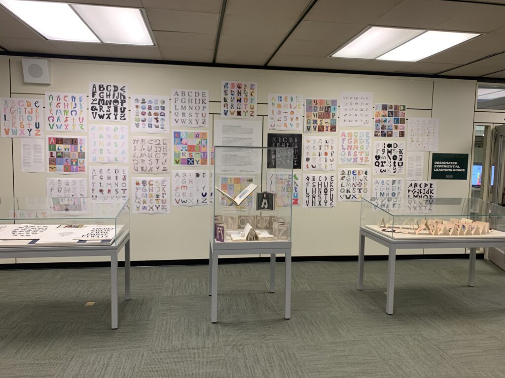
By Miriam Intrator, Special Collections Librarian
Colorful and whimsical, realistic and fantastical, serious and playful. These are just some of the themes depicted in the creative and inspiring alphabets designed by students in ART 2520 Typography, taught by Sarah McDowell, during the spring 2024 semester. Inspired in part by a visit to view typographical specimen books and artists’ books featuring typography and typographical experimentation from the rare book collection, the students “were challenged to find, photograph, design, draw, create and/or construct 2-4 letters of the alphabet over the course of 9 weeks.” The result of this assignment is a wide array of uniquely creative alphabets, on display on the 5th floor of Alden Library through July 31st, at which point they will be moved to the 2nd floor for the 2024-2025 academic year.
Student artist statements
Ella Huelskamp: I wanted my alphabet to be different kinds of foods formed into the letter. I first sketched out the letter with pencil, and then painted over it with watercolor. I then outlined most letters with black pen, and scanned them individually.Lastly, I cut out each letter in photoshop. This process took some imagination, but overall left me with a fun, playful, colorful, and somewhat child-like alphabet!
Laredo Cienik: My alphabet poster is filled with an artistic freedom. Each letter embodies a unique journey of imagination, with no predetermined theme to constrain its expression. From whimsical doodles to abstract forms, every character invite viewers to explore how my brain processes a prompt. Through this collection of letters, I aim to evoke a sense of wonder and curiosity, inviting viewers to find their own narratives within the alphabet’s playful chaos.
Gabe Hernandez-Martin: My choice in designing an alphabet related to a sheet music style stemmed from my interest and passion in music. While I am going into design, I had at one point considered going into music with my knowledge of the trombone and guitar. So, I started out designing the alphabet around the bass clef and planned to keep it as focused on the notation as possible. Unfortunately, there is not a whole alphabet worth of letters in sheet music, thus I took some creative liberties to design around what you could expect to see within the page.
Amy Klimkowski: For my poster, I chose to draw a different mythical creature that corresponds with each letter. My creative process included looking at many reference drawings and photos online. I used Procreate to make the different pieces and parts of each block. I wanted each drawing to have texture and dimension, so I experimented with different brush strokes within the program. I tried to create a somewhat rough and sketchy texture for each of the elements within my poster, by using digital pencil strokes and an acrylic paint type brush for colored elements.
Amalia Feliciano: The first part of my process in making the letters of the alphabet was creating a color palette. I wanted to keep them light, so I settled on creating a soft, curved, and bubbly font for my letters. I practiced for a bit trying to settle on how I wanted to curve and shape the letters so that they all looked consistent despite being different sizes. I used colored pencils and blended them together, and when I scanned them and began editing them, I decided to smooth the letters out just a bit because I liked how you could see the pencil strokes in each one. Finally, I decided to keep the background white to keep the light, fun look and felt as though going with a darker color would create too big of a contrast.
Greta Delapp: I have always been interested in both visual art and creative writing, so I was very enthusiastic about designing my own alphabet. I imagine that this alphabet will eventually be used as illuminated initials in a book format. I am currently writing a short story that takes place in the 1910s and 20s, so I wanted to pull visual references from those periods. Some of the imagery is intended to offer elements of contrast. For example, “I” is an almost medieval initial while “T” is a telephone wire. With these visual references in mind, my goal was to create an alphabet that is classic and elegant while still feeling contemporary.
Sydney Dadosky: I wanted to create something that is exceptionally playful and imaginative; something that is unlike your “typical” alphabet. I often see fonts that look quite similar to one another, the differences minute and inexplicable. For my cat alphabet, I made sure to create different cats that possess varying personalities with the hopes of producing a completely unique alphabet that is both memorable and charming for the viewer.
Nina Blair: For this alphabet, I was highly inspired by groovy, funky, and retro typefaces that utilized a decorative style. My main inspiration was the fun colors and daisies of the late 1960s and early 1970s. For this piece, I went with a hand drawn approach, first creating all letterforms with pencil on paper and translating them to Photoshop and Illustrator to create crisp, even stroke outlines. This alphabet was created with legibility in mind, and I hope one day to add lowercase letters to create a decorative font available for download.
Ella Middleton: For my alphabet poster, I wanted to give each letter a fun loving feel. This can be seen in how none of them are the same but also are presented to be unified in their design.
Angel Solokha: My work explores some of the extremes of letter forms. From providing as little information to adding more than enough information, I wanted to play with the letters and see what they would turn into. Throughout the piece, I really wanted to incorporate texture. Calligraphy, old English, and graffiti really inspired this piece and I tried to put my own spin on each letter.
Mattes Brown (former Mahn Center intern!): For my alphabet sketchbook assignment, I decided to draw each individual letter. I wanted to incorporate a fun, futuristic feeling into my font. I found that each week as I developed my letters, the style changed overtime. I became familiar with experimentation, creating my main outlines, then allowing a free creative flow.
Elizabeth Rose: At the core of my artistic practice lies a fascination with the forms of everyday objects, animals, and plants. I manipulated these elements in unexpected ways to create letterforms. Through my use of traditional color, line, and composition, I create life in these static symbols of language. I achieved this art style by drawing each letter on paper and adding color to each letter digitally. This fusion of traditional drawing and modern technology lends my alphabet a timeless quality, inviting viewers to engage with it on both an aesthetic and conceptual level. Mediums: Pencil, Sharpie, Adobe Illustrator, and Adobe Indesign.
Carley Hinton: Using carefully chosen vivid colors and simplistic patterns, my alphabet was made to create a piece that brings bright, chaotic, and lively letter forms to life.
Jakob LeMasters: I created inflatable men in Adobe Illustrator by using the pen and using the inflating effect by also adding the texture of light and plastic smooth texture.
Presley Manson: Flowers bud, then bloom, then fall, but these ones are here to stay. For my alphabet, I wanted a clean and professional look. Taking inspiration from my desire for summer, I designed a collection of 26 flowers. I knew I wanted to do something that matched the design to the letter, so I chose flowers that started with that letter. Using Procreate, I made these eternal flowers bloom from the stems of their letters. The names of each flower are written underneath to show each flower’s identity.
Gwyneth Shoemaker: Using inspiration from Pinterest and typography books, I drew each letter in my sketchbook with a black ink pen. I allowed myself to experiment with many different ways I could create the letterform. After that, I refined the letters in Photoshop and Illustrator before placing them into my final file in InDesign. Ultimately, creating a black and white poster that focuses on the form of each letter.
Julia Thomas: While creating my alphabet poster design, I wanted to include lots of visual interest. I planned to achieve this by using various color choices and designs that were different than one another. Each letter is a matching word which starts with that letter with a colorful background.
Ashley Strayer: I knew I wanted to experiment with physical forms for this project, coming up with ideas to do sewing, embroidery, or crochet— but ultimately I ended up using air-dry clay and acrylic paint to build my alphabet letters. I enjoyed this project because I love using my hands to create sculptures, and adding all of the tiny details really made my letters stand out from the rest. I wanted to do a more creative twist on the idea of a letter being represented by an object that starts with that letter, and sculpt my letters to be a less-expected idea to represent them. Overall, I feel that this project represents me and my creative process very well and is a unique take on the idea of a traditional alphabet.
Kianya James: My design choices were fueled by the need to study for my Japanese class. All of the letters are based on Japanese kana (syllabic Japanese scripts), and I tried to match each letter sound with a similar kana sound (a few exceptions: V and ウ; X and じ). I originally made the letters in full color but decided to go with black to draw focus to the script and the calligraphic nature of the designs.
Nicholas Monago: I decided to make my alphabet a solid and simple design with a hard and intimidating exterior. By deliberately focusing on sharpness, I was able to make my letters appear sharper from further away, but duller the closer you get. The series of ideas evolving continuously for this project was worth the time spent on it. Creating this project helped my indecisiveness about some of my other design decisions.
Sydney Kane: For my Alphabet Poster, I used a sketchbook app on my iPad to create all the letters. Rather than sticking to a specific theme, I chose to make each letter random. I decided to keep the letters black and give them a white background to maintain a sketched appearance throughout the poster.
Kelly Ernst: My illustrated alphabet was a project that I found I genuinely was able to let loose and have fun with. I used my favorite mediums, microline pens and alcohol markers, to illustrate objects and letterforms that I enjoyed drawing. I attempted to stick with a more gothic fantasy theme but still explored concepts freely while making the letters. There was trial and error to this project, as I found myself starting over a few times to create a uniform alphabet that I could be proud of and feels personal to me.
Cordelia Mendenhall: My process in creating this poster was to illustrate a Pokémon for every letter of the alphabet. Some were easier than others to make fit the shape of the letter they represented. I had fun adding little extra details to the Pokémon, like how some of them are shiny or regional variants. I decided for “I” and “J” to make them go together, instead of making them two Pokémon I went with “I” being stars and “J” being a Pokémon commonly associated with stars. I also decided on a simple white background as to not draw attention away from the letters and illustrations.
Georgia Booth: I wanted to incorporate multiple types of media throughout my creative process and ended up using a combination of drawings, photographs, and computer editing. This resulted in a chaotic yet vaguely cohesive end result. I feel like this alphabet reflects my artistic style well, and the lack of direct theme somehow gives it a theme. It reminds me of the mixed style of ransom note lettering.
Ella Wise: For my poster I decided to do different movies that I myself have seen, I believed that to make the piece both interesting and challenging. Each letter is done by hand, then digitized and then vectorized. Overall, It is a fun poster where you get to guess what movie goes with each letter!
Nicole Bell: It’s easy to take ordinary, everyday things for granted, so I was determined to make them into art. I brainstormed in my sketchbook and went to procreate to illustrate each individual letter. In order to make them cohesive, I picked a bright color scheme to highlight the joy that can be found in the little things.
Additional students in the class:
Brooklin Clonch
Adriana Merdita
Jay Moore
Checklist of rare book items included in the display:
- Marion Bataille, ABC-3D, New York, Roaring Brook Press, 2008
- Cathy DeForest with Cathy Dorris, Girls: An Alphabet Book Inspired by Daughters, Ashland, Oregon, Jubilation Press, 2015
- Sylvia Hall, Aqueduct to Urinal: A Shorter Water Alphabet, England, Sylvia’s Parrot Press, between 1970 and 1990?
- Helen Hiebert, Alpha, Beta, Portland, Oregon, 2010
- Ronald King, The White Alphabet, Guildford, England, Circle Press, 1984
- Enid Marx, Marco’s Animal Alphabet: Linocuts, Oldham, Incline Press, 2000
- Ornamented Types: Twenty-Three Alphabets from the Foundry of Louis John Pouchée, London, I.M. Imprint in Association with the St. Bride Printing Library, 1993
- Wood Type of the Angelica Press, Brooklyn, The Press, 1975