By Sarah McDowell, Typography Instructor & Art Director at Ohio University
Alphabets@Alden is a poster series of personal alphabets created by ART 2520 typography students and instructed by Tabitha Asiedu-Gyamfi and Sarah McDowell over the course of 9 weeks during the spring 2025 semester. Inspired in part by a hands-on engagement session with historic and contemporary examples of typographic and graphic design texts from the rare book collection, the posters will be on display on the 3rd floor of Alden Library from May 13, 2025 through the end of the spring 2026 semester.
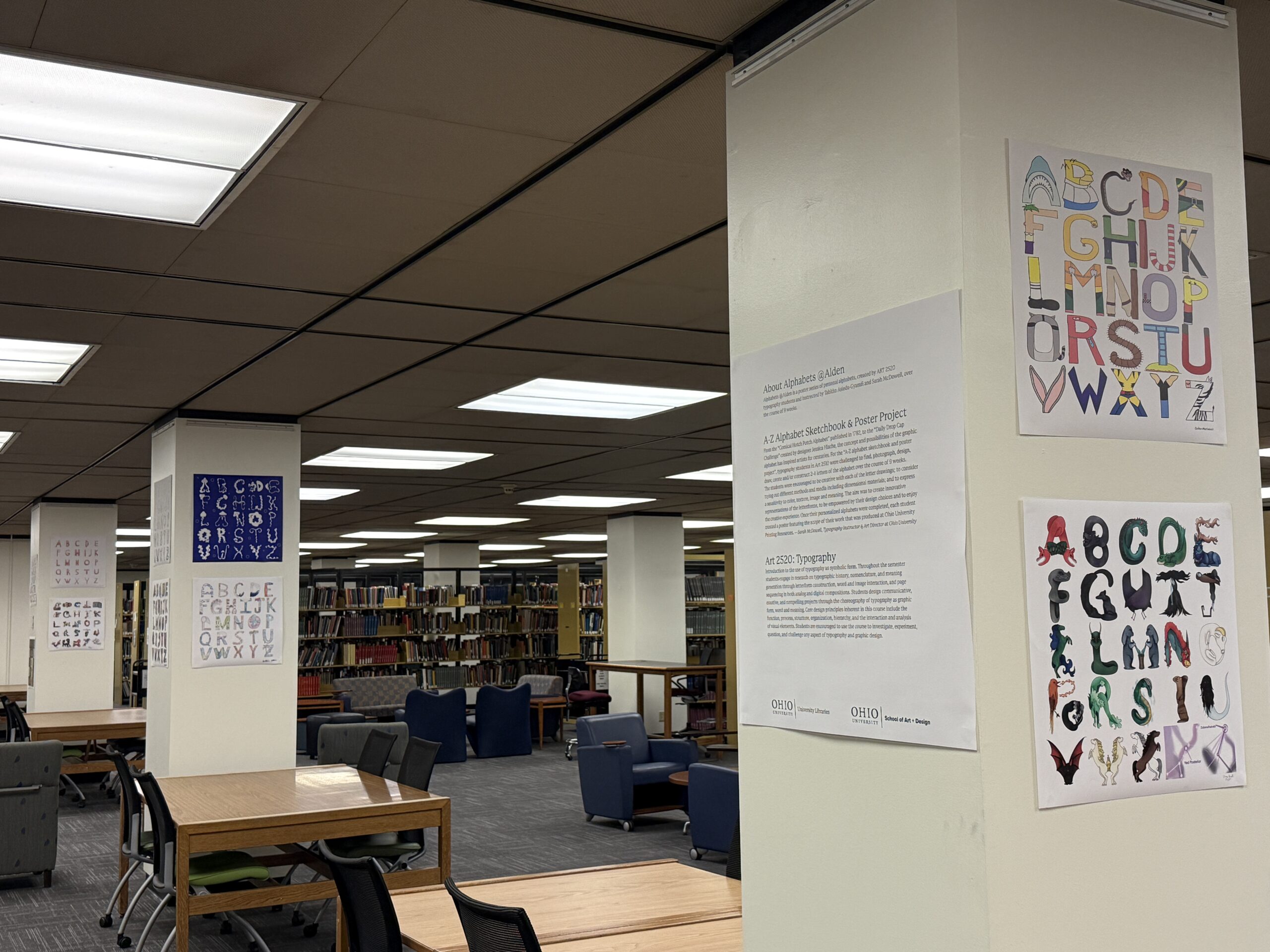
A-Z Alphabet Sketchbook & Poster Project
For the “A-Z alphabet sketchbook and poster project,” typography students in Art 2520 were challenged to find, photograph, design, draw, create and/or construct 2-4 letters of the alphabet over the course of 9 weeks. The students were encouraged to be creative with each of the letter drawings; to consider trying out different methods and media including dimensional materials; and to express a sensitivity to color, texture, image and meaning. The aim was to create innovative representations of the letterforms, to be empowered by their design choices and to enjoy the creative experience. Once their personalized alphabets were completed, each student created a poster featuring the scope of their work that was produced at Ohio University Printing Resources.
From the “Comical Hotch Potch Alphabet” (OHIO login required, public domain image courtesy of Wikimedia Commons) published in 1782, to the “Daily Drop Cap Challenge” created by designer Jessica Hische, the concept and possibilities of the graphic alphabet has inspired artists for centuries.

Art 2520: Typography
Introduction to the use of typography as symbolic form. Throughout the semester students engage in research on typographic history, nomenclature, and meaning generation through letterform construction, word and image interaction, and page sequencing in both analog and digital compositions. Students design communicative, emotive, and compelling projects through the choreography of typography as graphic form, word and meaning. Core design principles inherent in this course include the function, process, structure, organization, hierarchy, and the interaction and analysis of visual elements. Students are encouraged to use the course to investigate, experiment, question, and challenge any aspect of typography and graphic design.
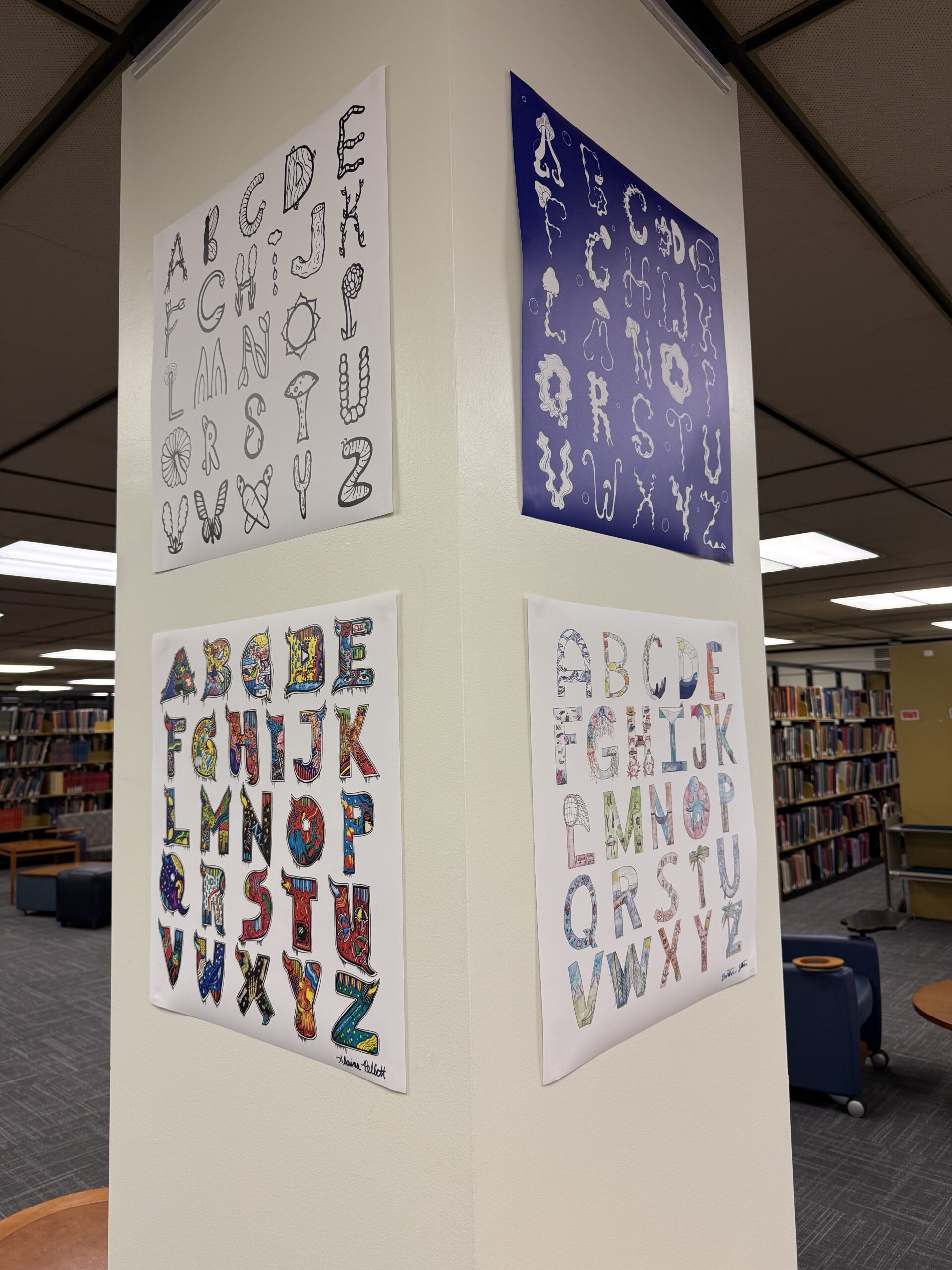
Student artist statements and posters
Alaina Pellett: When I first read the creative brief about this project, I had so many ideas running through my head. I work at the cafes here on campus and have always loved looking at these projects hanging up on the walls at the library. I knew I wanted to take a more artistic approach to this project while still adhering to creating my own font. I love the idea of graffiti or street art and knew I wanted to make a font that kind of represented this idea. I added large serifs and finials to exaggerate each letter and make them take up a lot of space. Each letter also has something I drew inside it that starts with the letter to represent it. For example, in “A” I drew an apple and an arrow inside. While I wanted each letter to be able to stand by itself, the way I arranged them on this grid was to kind of give the illusion of them running together. To do this, I added some ornamental paint drips to the bottom of each letter. Something that also inspired me for this project were the letters (also known as initials) that began a story or new chapter in old storybooks.
Alex Tandy: I loved doing this project! This poster is a carefully designed display of all 26 letters of the alphabet designed as foods. I decided to choose food as my theme for the typeface because there are so many different types of foods out there to work with, and I thought it would give me a wide berth of options for the best results. Throughout it, I experimented with different linework and thickness, different types of foods, and multiple ways of designing the letterforms. I wanted a poster that was cohesive and clean, while also harboring many little details that can be seen up close.
Caden Marinacci: For this project, I went with the theme of everyday cartoon references. Every letter is based on something I’ve seen in cartoons recently or from when I was a kid. My creative process was pretty straightforward. I would draw the letter out in pencil in my sketchbook, then stare at it until I could relate the letter to the form of a cartoon character. If that connection couldn’t be made, I picked a character whose name started with the letter I was on and would “dress” the letter up as that character. All letters were drawn by hand in pencil, traced with a black marker, and then scanned into Illustrator to be colored. I’m very happy with how it all turned out.
Gretchen Stoner: My theme for my alphabet project was a beach/summer theme. I wanted something with bright colors and something that would be engaging to others. I used mostly colored pencils and used sharpies for the outline of each letter. I used similar colors for the background of the letters for consistency. I used elements that remind me of summer and created some common scenes you would see during this time. I used block letters and sans serifs to create my alphabet. Some of my illustrations make up the shape of the letter and others are inside the letter. I sketched out each individual letter then colored and outlined them. I then scanned them as PDFs and uploaded into Photoshop. I removed the backgrounds and adjusted the levels of each image to make the colors stand out more. I exported all of the letters and created this print ready version.
Hannah Lisk: This project caused me a lot of blood, sweat, and tears, but in the end, it was definitely worth it. Technological issues aside (hard to forget) I really enjoyed every second of this process. Originally, I had planned to make every letter a different medium because I think I’m capable of executing a lot of different artistic approaches. I realized, though, it wasn’t a realistic idea, since most of my art supplies is back at home. So, I pivoted, and landed on making a quilt blanket out of my letters. I love all things embroidery and fabric, so finding images to use was very stimulating for me. It also proved to be very challenging too. It was difficult to find a background fabric that contrasted well enough with the fabric I used for the letter itself, and on top of that, both fabrics needed to have similar color palettes. And on top of that, each colorway of each letter needed to look good next to the surrounding ones, I needed to make sure there weren’t repeats. All in all, though, I believe my hard work paid off. I think my poster is very playful and visually appealing and I’m happy with how it turned out!
Izzy Hauck: When I started making my poster, I knew that I wanted to do with a familiar medium since it was such a big project and since we needed a physical copy, I deiced to start my poster by using watercolor pencil and pen. I am familiar with the medium, so it made it easier to use for a physical version, I also used this as an opportunity to get a baseline of what I wanted for the design to be and what colors I wanted for my alphabet. With my physical versions, I then transfer my design to a digital copy by redrawing my design or fixing some of the designs on the program procreate. When thinking of what I wanted my overall theme to be I decided to go with something I know well overall, mythology. With my overall idea being mythology, I really like the idea of using different mythical creature from different mythology like Greek, Norse, Celtic, Chinese, Japanese, Roman and Astronomy. Though since I am using so many different mythologies, I had to do a bit more research on the mythical creatures that each have, mainly Chinese and Celtic mythology.
Jordan Schoonover: When I initially heard about this project I jumped for joy; my brain filled idea after idea of all the different things and ways I could explore this project. I dove head first into this project and at first I didn’t have any real direction. For the few letters I did whatever felt right, going in detail to find something that gave the letter clear form while also thinking outside the box to the best of my abilities. Then I reached the letter k and decided to start incorporating my own artstyle into the letter forms, thinking less about how recognizable it was as the letter, rather I let my hands and mind run free. My art style is very distinct for its focus on eyes, teeth, and a sort of monstrosity approach. By allowing my mind to run rampant, I was able to effortlessly create the rest of my letters while still having a great time doing it. By the time I was done, you could visibly see my transition from exploring different ideas to coming to something concrete that I could flow with and overall I’m extremely satisfied with how my alphabet poster turned out!
Lanette Valentine: For this project, I wanted to challenge myself when creating my alphabet by doing something completely different than what I’ve ever done. I wanted to try, as I haven’t really seen it be done, to create the entire alphabet out of fruits and veggies from different places in the world. The challenges I knew when going into this was finding all of the fruits and veggies from all parts of the world. I first started with simple fruits and veggies, but when it got towards the middle, that’s when problems were starting to show. From finding good reference photos to even scrapping whole designs because it wasn’t working for the letter was very challenging. I wanted my alphabet to be different and inspirational so that others can look and see other fruits and veggies from other parts of the world. I covered places like India, Asia, South America, Mexico, China, Japan, Brazil, Africa, and many more. I wanted to do this alphabet as I wanted to challenge myself, but also show parts of the world in this piece. Overall, this project had its challenges, just like with any other piece, from difficulty to finding photos for accuracy to even finding some fruits and veggies that would work for this.
Letitia Oteng: For my A–Z Project, I drew inspiration from jellyfish. Jellyfish are free-flowing, beautiful, and interesting to look at. I wanted to create an alphabet set that would emulate that while also being fun. The process of creation was a bit difficult because this could go in any direction, the possibilities were endless, and I couldn’t find this being done before. I had to consider balancing the type aspects with the jellyfish aspects. Things started off more illustrative, but as time went on and I kept experimenting, I was able to create letters that had the curves and textures of a jellyfish while maintaining the recognizable form of the letters. Some letters have the jellyfish head, while others delve more into the decorative tentacles. At the end of the day, I just wanted people to look at it and think, Oh, jellyfish, while still knowing that this is the alphabet. I think some letters lack this a bit individually, but as a whole, it’s pretty cohesive.
Overall, I think the project challenged me to think intentionally about each small part of a whole. It also challenged me to have fun and free-flow as well. There were definitely times when I was overthinking things, and that showed in the final product. When I thought a little too much, the letters started to lose that natural, flowing quality I was aiming for. Letting go and allowing the forms to develop more organically helped me get closer to the feeling I wanted something that felt light, fluid, and just a little bit whimsical. Additionally, this project gave me a deeper appreciation for people who create type and fonts. There’s so much work that goes unseen. I can tell that these creators put in a lot of time and effort, all with the hope that what they’ve made will communicate something, even if it’s just a small part of a bigger picture.
Madison Barrickman: When tasked with coming up with an idea for this project, one of the first things to come to mind was to make a spring themed alphabet. After somewhat of a harsh winter, I know many people were longing for warmer days. The spring theme allowed me to draw out all sorts of ideas into letters instead of having it become repetitive, which I really enjoyed. In the end, I feel really content with how my project turned out.
Mateo Mora: Inspired by my love for claymation, this project was an opportunity to create a piece that both challenged consistency and pushed the boundaries of a common typeface. I chose to sculpt each letter out of platinum white oven-bake clay to promote texture and dimensionality. The letters were then colored and edited within Adobe Photoshop, fitting into one of six hues chosen to match the typeface’s playful nature. Letters were each sketched individually prior to sculpture to best find unique manipulations of the forms’ structure, weight, and balance. Photographing the sculpts for this project was challenging — without access to a consistent location or studio, the strength of highlights and shadows became a major variable with little solution found in the editing process. The typeface now sits on a plain off-white background, showcasing the unique depth, tilt, and shadow present in every letter.
Precious Powell: Creating my own alphabet was both challenging and exciting, especially since most of my work was done on loose paper. I had several detailed ideas for how I wanted to approach the assignment, but many of them felt too complex to execute effectively. After struggling for weeks with these concepts I decided to take a different approach one that was more spontaneous and enjoyable. Instead of over-complicating the process, I let creativity take the lead, which allowed me to have fun experimenting with different shapes and styles. Looking back, I realize how much I enjoy learning about typography and how letterforms are used in design. It would have been great to explore more structured techniques for creating a functional alphabet, especially in ways that could be applied to digital or graphic design but, this experience showed me the importance of balancing structure with creativity and how sometimes simplifying an idea can lead to a better outcome. This project pushed me to think differently about how letters are formed and designed. It reinforced my appreciation for typography and its role in visual communication. More importantly, it reminded me that design is just as much about exploration and flexibility as it is about precision.
Sophia Salvatori: For the alphabet assignment I wanted to dive into the world of typography at full force. I soon realized the world of typography can be much more interesting, diverse and complex than I realized. I had another design in mind for this project that was scrapped at the last minute and I created something I feel is much stronger and comprehensive. I found doing a letter every other day made the designs wildly differ from each other and I had a hard time keeping a consistent theme. When I sat down and did them all at once I was able to create more harmony. I take much of my typography inspiration from graffiti. I have always been drawn to graffiti fonts and decided to stylize my alphabet in the likeness of graffiti art. I think graffiti is an important world in art and should be seen as more of an artistic statement than something to be offended by. I found insight into the challenges and rewards that creating fonts can bring, as well as typography as an artform.
Sydney Saling: This project is a collection of letters inspired by the look and feel of pool balls and the game of billiards. I was drawn to the bold colors, smooth shapes, and the way everything is arranged and moves during a game. I wanted to bring that same energy into my typography project. I created each piece using Adobe Illustrator and Photoshop, focusing on shape, color, and layout. Instead of making the letters easy to read, I treated them like visual objects — each one with its own personality, like a ball on a pool table. I played with balance, spacing, and layering to give them a sense of motion and style. This collection is more about feeling than function. It’s about turning familiar letters and numbers into something new, something that captures the vibe of a game in progress. It was a fun and creative way for me to explore how type can be more than just words it can be art, too.
Tony Vacca: This playful, hand-drawn typeface is inspired by the sweet nostalgia of ice cream cones on summer afternoons. Each letterform is designed to mimic the swirl and texture of soft serve ice cream sitting atop a waffle cone, rounded, creamy curves paired with subtle diagonal lines reminiscent of a cone’s cross-hatch pattern. The typeface blends whimsy with warmth, inviting a sense of joy and lightheartedness in any design it’s used in. The design was born from the idea that typography can evoke not just meaning, but memory and sensation. I wanted the letterforms to feel delicious—something you could almost taste. Its soft edges feel friendly and comforting, while the cone-like patterning in the stems and legs adds a tactile, almost edible texture. This typeface is ideal for branding, packaging, and playful editorial use, especially in food, children’s products, or nostalgic campaigns. Through this work, I hope to channel the emotional power of visual design using typefaces to awaken the senses, make a smile, and remind us of the simple joys that often live in the smallest details. Typography, like ice cream, should be a treat.
Zoe Geiss: For this project, I wanted to create an alphabet that looks ornate and uses eccentric serifs to tell a story. Inspired partly by classic fancy letterforms and partly by the shapes that we see when light hits a glass, I wanted to curate an alphabet that had a different take on the morphology of each letter. I experimented a lot with “intrusive strokes” that bulge out in ways that contrast
how the letter is usually shaped (as seen in letters D, U, P, R) Additionally, I made an effort to create negative space in some of the letter strokes. Not only to visually balance the black vs. the white, but also to add details in ways that differ from a serif (notably in K, M, N, O, X). I had a lot of fun with this project over the course of this semester and learned more about creating vector art in Adobe Illustrator, which is an important skill to hone as a Visual Communications major. My main process involved a sketch and upload to my computer, image tracing the photo to make it seamlessly black and white and then tracing over that image and refining the shape of the letter from there. Because of the fact that color wasn’t of consideration to me, I had to make sure to spend extra time refining the weight of each stroke, ensuring visual balance, and ensuring each rounded edge was shaped cleanly. And although I’m sure I could’ve kept finding refinements to be made on the letters forever, I feel pleased with how the end result turned out.
Further Exploration
See and read about the 2024 alphabet posters
Browse typography and graphic design in rare book Publishers’ Bindings
Learn more about the rare book collection