By Adelle “Del” Stratton, History ’25 with a minor in Computer Science and certificate in Italian Studies, Digital Initiatives Assistant
This blog post details the creation of the Athens, Ohio 1885-1923 Sanborn Map Viewer, an interactive web map that displays historical map layers over present-day geography. The viewer can be accessed at https://bit.ly/athens-sanborn-maps.
Individual tile layers for each map year are also publicly available for reuse in ArcGIS Online.
The Sanborn Fire Insurance Maps, a collection of maps published by the Sanborn Map Company, were made in response to fires during the 19th and 20th centuries. These maps of over 12,000 towns and cities within the United States ensured that almost every community with over 1,000 people would have documentation in case of tragedy. Unlike other maps of these eras, the Sanborn maps contain very intricate details of the businesses and features of the area that they cover. They allow historians and other interested parties to examine how cities have changed over the decades. The Sanborn Map Company held a monopoly over fire insurance maps until their decline from the late 1930s to the late 1950s when they began to go bankrupt.
To create these maps, the Sanborn Fire Insurance Company would send surveyors, typically known as “striders” or “trotters,” to sketch and chart the cities/territories they were assigned. During the late 19th century and early 20th century, they created entirely new maps to document the changes in the urban landscape. In between their new editions of published volumes, they would frequently have “paster” updates. They would use previous maps and overlay the section that needed to be updated with a new piece of paper, effectively “pasting” it. After they started to lose profits, they ceased the creation of new maps; instead, they chose to recycle the base from previously published volumes. The last of these updates occurred in 1967 when they ceased all productions.
Athens, Ohio is one of the 12,000 cities to have a Sanborn Map dedicated to it. There are seven published volumes in the public domain spanning different years: 1885, 1890, 1895, 1900, 1907, 1914, and 1923. Additionally, two further maps are not yet available for public use. The available ones are made public through the Library of Congress; in the late 1990s, the Library of Congress began a mission to digitize and upload them for public use. More recently, Kent State University was chosen to digitize and maintain the Ohio maps. The licensing for the unavailable maps is currently under a company known as LightBox. Previously, they were licensed under another data company: Environmental Data Resources (EDR). The later maps that are not yet available were created after the late 1930s, during the decline of the company; they used the 1923 edition as a base, updating the sections using the “paster” method according to the year.
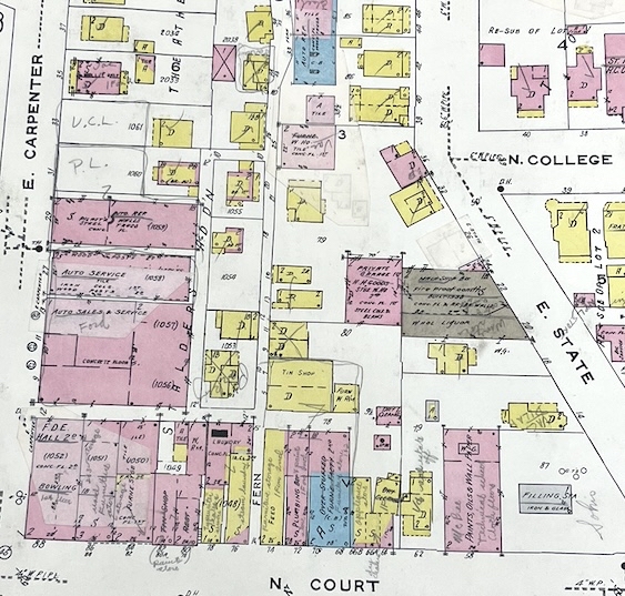
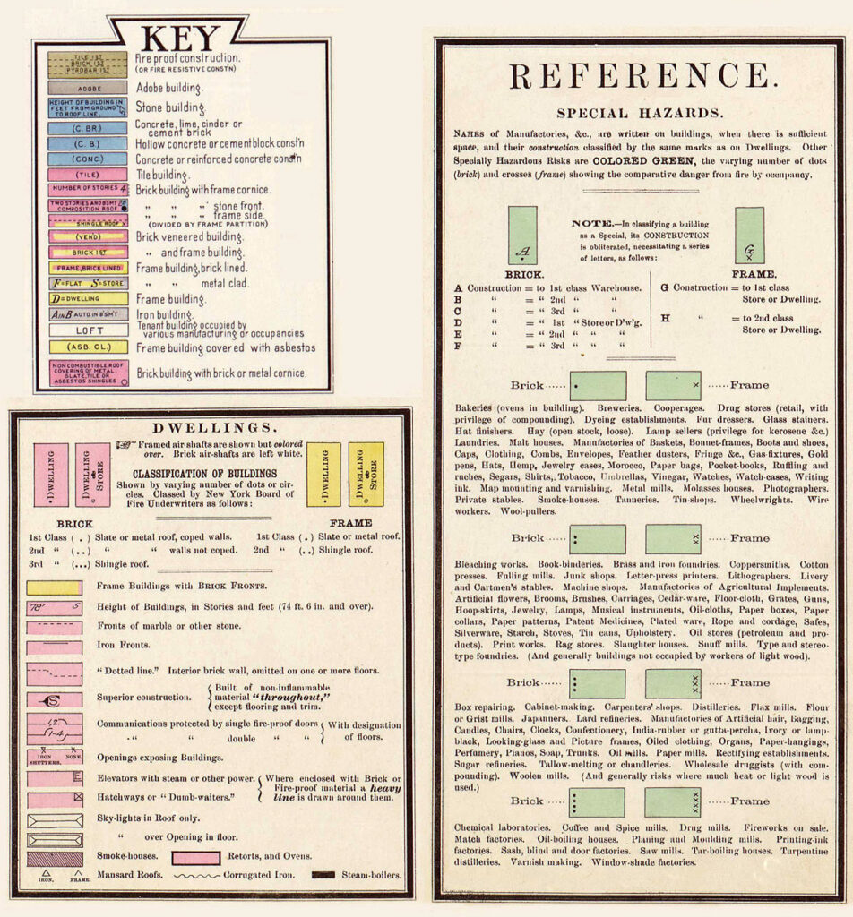
The maps themselves are relatively simple in design. The city or town is split into different sections, with each section being displayed on the first page’s index as a reference. The map in its physical form is not unified, but separated by numbered pages. They detail the small pieces of the town. Some examples of these structures include railroad lines, rivers, sheds, or other similar buildings that could have been affected by fires. Building structures are represented through different colors to signify what they were built with, such as tile or brick; additionally, they include details such as if they were veneered or how many stories there were. They also list what the building was, ranging anywhere from a grocery store (gro.) to personal dwellings (dw’g). There are a multitude of abbreviations to represent how the city or town has changed over time, as stores would frequently replace one another.
Throughout the Spring ‘25 semester, I was able to successfully geo-rectify all of the available Sanborn Fire Insurance Maps of Athens, Ohio thanks to Kent State University’s digitization. To do so, I worked in ArcGIS Pro to upload map files and manually enter control points for location accuracy. ArcGIS Pro is a powerful Geographic Information System software that eliminates the use of third-party apps to create a complete version of these maps. It grants users the option to transform the map to conform to the control points placed, but I decided to limit the distortion to maintain as much accuracy as possible to the original. ArcGIS also has a browser-based platform, ArcGIS Online. After starting to geolocate some of the more detailed maps for Athens, I decided to look to see what others had done for the Sanborn Maps.
When exploring ArcGIS Online, I stumbled across a detailed web map of Chillicothe’s 1890 Sanborn Map. This map, created by user ‘sg4002_csungis,’ individually places each of the pages from the Sanborn maps, ensuring that the entirety of the documented locations were geolocated. Additionally, this map contains data points to display where the saloons were located in 1891 and 1897. I was incredibly excited to see how this user chose to display the information, particularly the index. The Sanborn Map Index is the front page for all of their maps. It displays the entire town with a simplified version of the complete map, but it highlights the pieces of the town and informs the viewer what page they need to find for the smaller, more intensive account of that section. In the case of the web map, it informs the viewer where each of the sections was located in the original map publication. The creator of the Chillicothe web map had set limitations for the visibility range so that when viewers scroll closer to the map it will disappear. Additionally, they used a base map that incorporates a Hybrid Reference Layer, allowing the viewer to see an overlay of current roads on top of the historical maps.
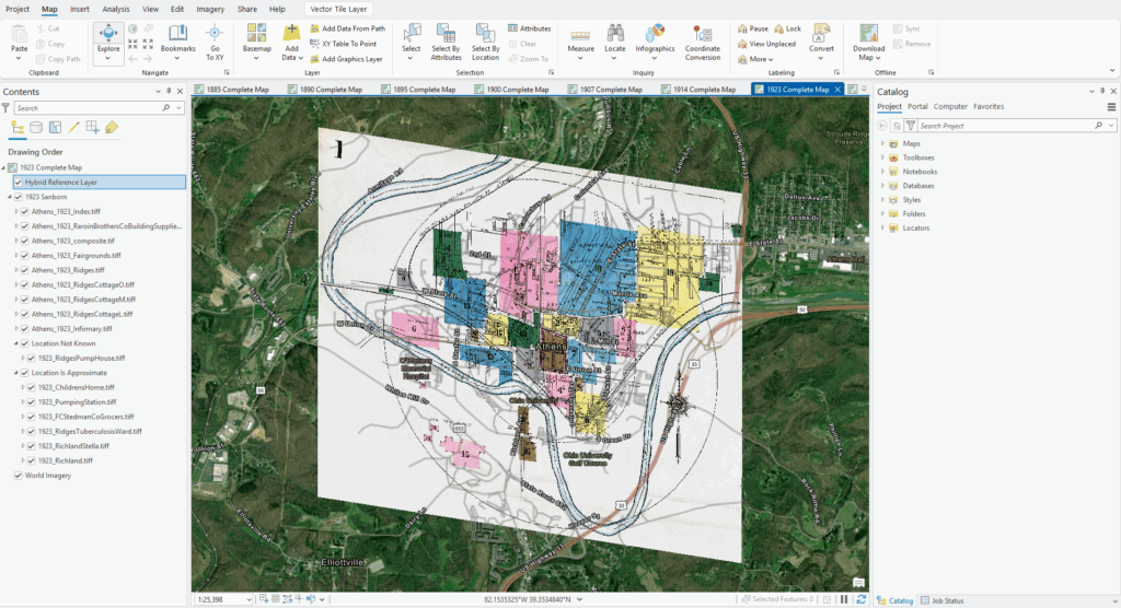
With this map as inspiration, I had a clearer idea of what I wanted to create–a complete web map that contained ALL of the data from the original maps, including the sections not attached to the larger map. Following the basis set by the Chillicothe Map, I saved the indices for each of the completed composite maps and edited their visibility range to disappear as you zoom in closer to study the details. The composite images, or the pieces that combined with other sections, were easier to determine. The indices provided a general idea of how they were combined, and these pieces were stitched together in Photoshop to make the process easier (excluding the 1895 and 1900 maps). This ensured that there would just be one file to work with instead of many separate files, which would have resulted in a possible error during the uploading process. I managed to geolocate each of the composite images for all of the maps in a month. Afterward, I decided to go into the previously completed maps to extract the smaller, detached pieces that did not form part of the completed composite file. These detached pieces required more research and patience, as I had to manually locate historical documentation on where a lot of them used to reside. Many of the later maps helped determine the locations for these pieces from the earlier maps, as the later ones were more detailed in the road names. The structure for many of the buildings stayed nearly the same, minus additions of additional sheds and small renovations.
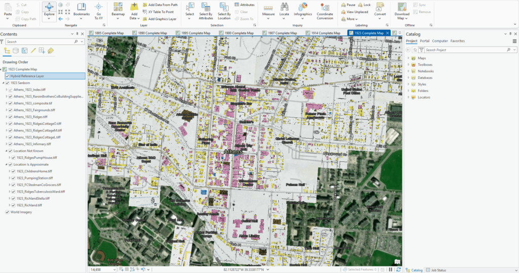
After I managed to locate and place the outlier sections, I had a complete geolocated map of each of the seven map years. I wanted to make the web map as organized as possible, so I ensured that the files were in the same order throughout the years; all of these files had similar names, although a couple of the businesses changed ownership over the years. Each of these individual GeoTIFF files contains metadata explaining when I last updated them, what the map is, and any disclaimers that may need to be known. Additionally, I also created two separate web layers for each map year–Location Not Known and Location Is Approximate. Location Not Known contains files that are NOT located accurately; I had to make an approximation based on the indices and limited historical data I could find, but they are not accurate. For Location Is Approximate, it is a group layer containing MOSTLY accurate files, but perhaps off by a couple of inches. Anyone familiar with mapping knows that a couple of inches can cause substantial errors, as it could equate to miles in-person or severely skew any sort of calculations made. I wanted to ensure that the user was aware of this fact so that they could do their research and improve the map.
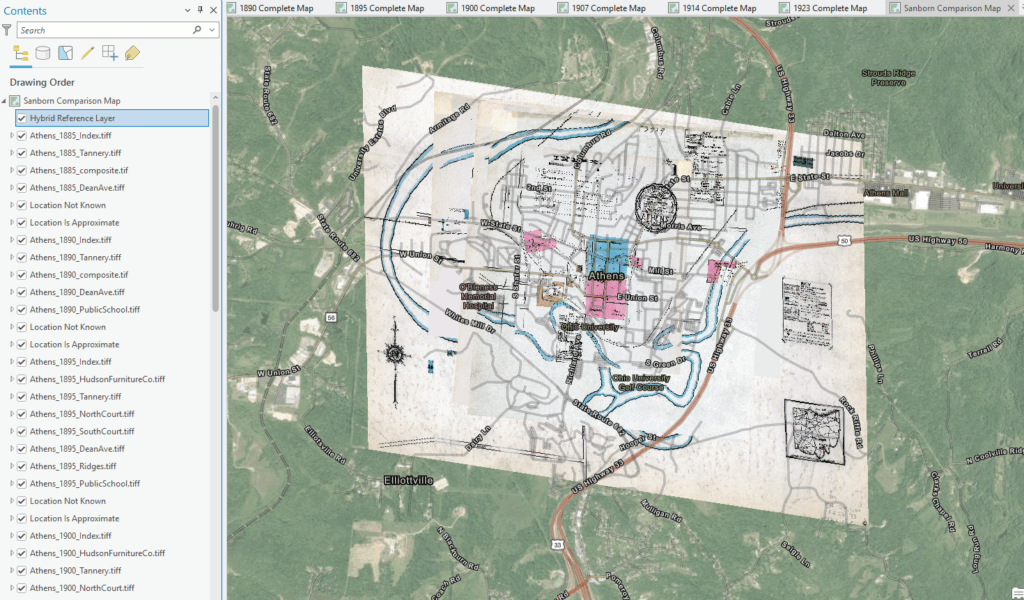
The most difficult part of the process was trying to ensure that cache failure did not occur during the upload process. Sharing this map as a web map via ArcGIS Online proved to be difficult since the storage of the multitude of files became complex. These files could easily become corrupt if they were altered in any way, as the one geo-located image is created through three separate files. If one file malfunctioned, the entire image could warp. Most of the uploading process included inserting metadata, configuring the files to have the correct visibility range, and double-checking for failure. Originally, I had to continuously delete and re-upload the maps due to issues with tile creation–AKA the creation of the images in ArcGIS Online. My final upload erased many of the previous issues, with it being relatively simple for user readability.
Using ArcGIS Experience Builder, Erin Wilson, the project supervisor, and I collaborated to form a user-friendly web page that would allow easy access to the maps. This was a multi-week process, as displaying data can be tricky. What was settled on includes a large map browser option, a key to enable and disable the different map layers, an option to change the base map, and a legend so that the user can interpret the map. Anyone can access this map today, as it is up and running at the time of this blog post. This format allows people to compare the maps with one another utilizing the transparency setting; additionally, people can turn on and off the different map years from the use of the map layers tool in the upper right-hand corner. Although there might be slight distortions, each map generally overlays accurately.
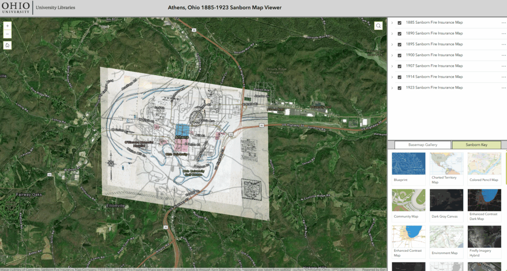
Uploading it in such a way allows people to study the urban transformation of Athens, Ohio. Researchers will be able to locate and identify buildings and neighborhoods, historians can track businesses throughout the years, and locals can utilize them to locate buildings for personal use such as for deeds or genealogy. This is, ultimately, a map that is useful for those interested in the history of Athens. It documents the transformation of the town from the late 19th century to the early 20th century. The Athens community can see the transformation of Court Street and the growth of Ohio University.
With this uploaded for public use, my final project for my undergraduate career has been completed. I am incredibly grateful for the opportunity to transform these maps for community use. I hope that future generations of Bobcat students will also develop a passion for these maps, as they continue to update and improve my work. Perhaps they will be able to more closely align the maps to one another, or fix color distortions that I was unable to get to. Truthfully, I learned much about GIS tools and techniques while working on these maps. I had a general knowledge of the field but had yet to work on a larger project to utilize and practice my skills. I feel much more passionate about the digitization of local history now. I would love to see collaboration between volunteers, students, and local historians to incorporate interactive data into my web map. Access to information is more important now than ever, so building the framework for this web map was an honor.
Bibliography
“About this Collection: Sanborn Maps.” Library of Congress. Accessed June 10, 2025. https://www.loc.gov/collections/sanborn-maps/about-this-collection/.
Black, Tobiah. “From Fire Hazards to Family Trees: The Sanborn Fire Insurance Maps.” Last modified June 12, 2024. https://publicdomainreview.org/essay/sanborn-fire-insurance-maps/?utm_source=newsletter.
“Library Announces Digital Map Project Pact with EDR Sanborn to Bring 1 Million Maps Online.” Library of Congress Information Bulletin. December, 1997. Accessed June 10, 2025. https://www.loc.gov/loc/lcib/9712/map.html.
“Ohio Sanborn Fire Insurance maps.” Kent State University. Accessed June 12, 2025. https://oaks.kent.edu/sanborn.
“Sanborn Fire Insurance Maps Now Online.” Library of Congress. May 24, 2017. https://www.loc.gov/item/prn-17-074/sanborn-fire-insurance-maps-now-online/2017-05-25/.